Introducing Version 5.0: New Feature Release
Product Release 5.0
We’re thrilled to announce the arrival of Sprocket 365 version 5.0, a major milestone in our journey as we introduce our rebranded extension for SharePoint. With our exciting new look and feel, we’ve also been busy working behind the scenes to bring you an enhanced suite of Web Parts and features, all aimed at delivering an even better SharePoint experience in Microsoft 365.
Our latest update includes a range of exciting enhancements and fixes aimed at elevating both functionality and user experience, as we launch our new era of digital workplaces in SharePoint.
Table Of Contents
Hero Web Part
Unleash the Power of Visuals on Your SharePoint Sites
The hero section of a SharePoint site, located below the logo and menu, is essential for grabbing your users’ attention, especially when it serves as their starting point in SharePoint. Understanding the importance of a well-designed hero section, we are excited to introduce the new Hero Web Part.
With this Web Part, you can create striking custom hero sections on your SharePoint sites, harnessing the power of visual impact. This prominent element sets the stage and captivates your users as soon as they land onto your SharePoint site.

Text Overlay
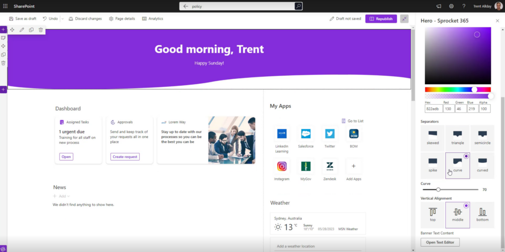
Take control of the text that overlays the banner with dynamic variables such as first name, last name, today’s date, greetings, or the day of the week. You have the flexibility to align the text in the center, left, or right of the banner. Additionally, you can toggle the background gradient on or off, giving you more design choices.
Height Adjustments
Want to make a stronger impression? Easily adjust the height of the Hero Web Part to create a larger and more visually prominent presence on your SharePoint sites.
Seperator Layout
The Hero Web Part offers an additional layout option called the Separator. Instead of using a background image, you can use different shapes and angles of separators to add colour and visual interest to your hero banners.
New Sprocket Settings
As part of version 5.0, we’ve revamped and simplified the Sprocket 365 settings panel for an improved user experience. Access it easily through the new Sprocket symbol entry button in the bottom left hand corner. The interface has undergone minor tweaks to streamline the organisation of settings and sections. We have introduced a new General section and made small name changes to simplify the menu, making it more intuitive for users
New Features
Under the newly introduced ‘General’ section, we have added a set of exciting features that aim to enhance your custom branding and improve the overall user experience of SharePoint.
Favicon
Favicons play a crucial role in helping users quickly identify your website among multiple open tabs and easily locate it in their browser history.
That’s why we have included the option to set a favicon as part of our suite of features. By setting a favicon, you can ensure that your SharePoint site is easily recognisable when accessed through a web browser.
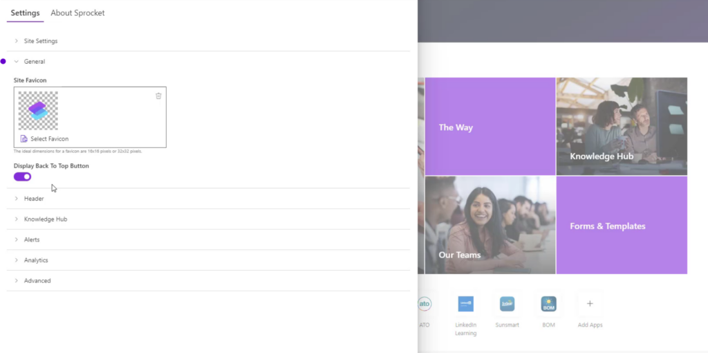
When navigating to another site in the Hub, you will notice that the general settings are inherited by default. However, you have the flexibility to customise these settings according to your preferences.
Floating Back to Top
Another valuable addition under the General section is the floating “back to top” button. As you scroll down the page, an icon will appear in the bottom right-hand corner, allowing users to easily navigate back to the top. You can enable this functionality if you find it beneficial for your user’s browsing experience.
Search Web Part
Enhance site navigation and content discovery
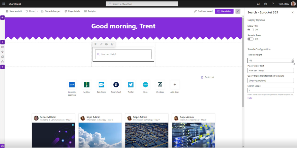
Version 5.0 introduces a new search box into SharePoint, a game-changer that brings the standard top search functionality into a dedicated Web Part. By adding this search box to your SharePoint sites, you can enhance the user experience, make search more accessible and have greater design flexibility, allowing your pages to be centered around search and content discoverability.
Search Box Customisation
Customise the search box to fit seamlessly within your SharePoint site by adjusting its heights and adding personalised placeholder text. With this flexibility, you can create landing page style SharePoint sites, that center around the search box feature.
As for the configuration, you can refine search results with additional filter information, enabling users to easily narrow down their search and quickly find specific information and content.
Knowledge Hub
Out-of-the-box Document Converter
We can’t contain our excitement about this latest update in Version 5.0 – the introduction of Document Converters in Knowledge Hub! This powerful feature lets you convert documents right from your document library, completing simplifying this process.
Previously, converting Word documents to a page or PDF in SharePoint required Sprocket Actions, Power Automate, and a premium license. So, to reduce all this complexity and give you more control straight out of the box, we have simplified the process by integrating this functionality directly into Sprocket 365.
Here’s how it works. To get started, head to Settings > Knowledge Hub and enable the “Enable Document to Page and PDF Conversions” option. Keep in mind that it’s not turned on by default for all sites. Once enabled, any document library with .docx files will have a fantastic new feature: the Convert Document button right at the top.

Select the document or policy you want to convert, hit that Convert Document button, and choose whether you want a page or a PDF. Our incredible Document Converter takes care of all the heavy lifting, ensuring your formatting and images are all maintained. The converted document seamlessly becomes part of a page in your Knowledge Hub, and a handy PDF version is available for download too.
This update is all about making your life easier and giving you more powerful features out of the box.
Goodbye Size Limitations
We’re also removed all restrictions on the size, number of pages, and overall document size. Now, you can freely convert and include even your largest documents in your Knowledge Hub without any issues or errors.
This means no more constraints holding you back! Whether it’s a lengthy policy document or a meaty report, you can confidently send them off to the converter and have them seamlessly integrated into your Knowledge Hub.
Table of Contents
To improve the user experience of your Knowledge Hub, we’ve also upgraded the Table of Content Web Part to bring you even more flexibility to your navigation experience. With the new enhancement, we’ve included the left menu as a data source, resulting in the creation of buttons for each item in the tree navigation.
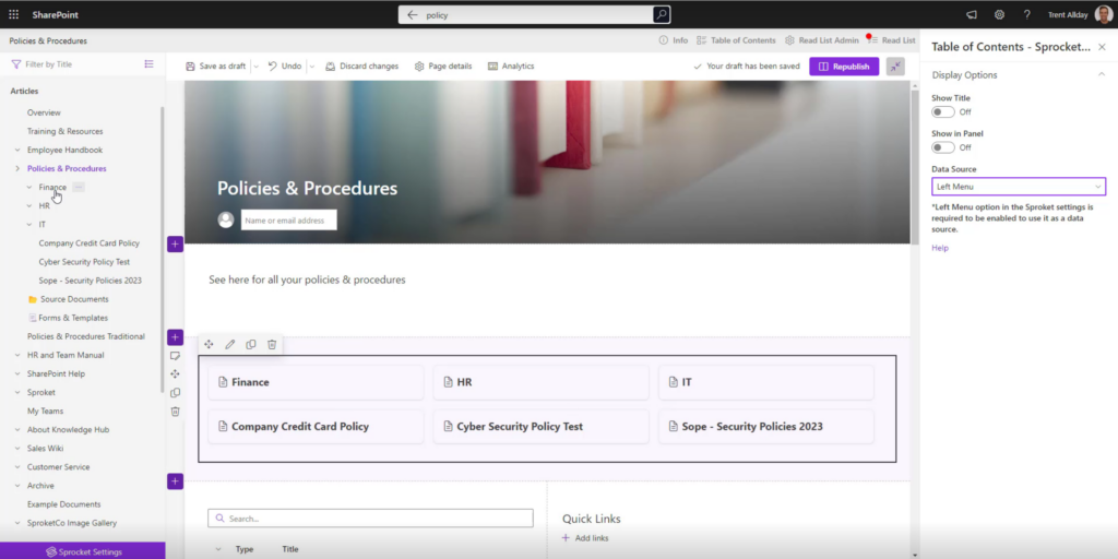
Previously, the Web Part only displayed headings, but now it generates buttons for every item in the tree navigation. Each button represents a node under a specific item, making it a breeze to navigate through your content. This update is especially beneficial for landing pages with multiple subpages.
Cloning Reading Lists
Another time-saving feature in Version 5.0 is the ability to clone a reading list in the List Admin Centre. We’ve added a new button that allows you to effortlessly clone an existing list, eliminating the need to create reading lists from scratch. Now, you can set up new lists in just a matter of minutes.
With the clone feature, you can easily duplicate the configuration of a reading list, saving you valuable time and effort. While the cloned list doesn’t inherit the audience from its clone, it retains all the settings and setup, making it quick and convenient to create similar lists.
You now also have the ability to hide inactive reading lists, disabling any legacy read lists you don’t want your users to see or access.
People Hub
We’ve simplified the configuration of People Hub, creating a much more streamlined user experience.
With our new configuration panel, you’ll find it easier than ever to customise People Hub according to your preferences. The panel is organised into four tabs: General, Directory, Tree, and Advanced. Each tab focuses on specific settings, ensuring that you can quickly navigate and adjust the relevant options.
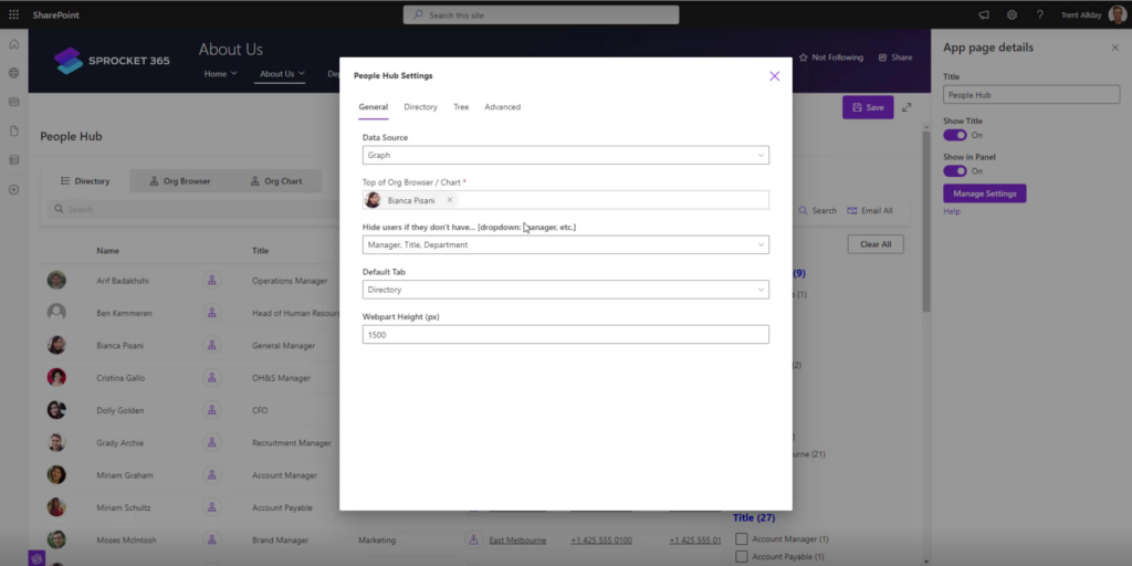
Not only does it save you time by reducing the complexity of the configuration process, but it also empowers users of all levels to effortlessly set up People Hub. e relevant options.
Version 5.0 Full Demonstration
Try Sprocket 365 free
As we mentioned, Sprocket 365 5.0 is packed full of exciting features that will truly make a difference in your SharePoint experience. Let’s summarise the key highlights:
- New Web Parts: Expand your possibilities with the addition of two new web parts, Hero and Search, empowering you to create captivating and easily discoverable content.
- Simplified system settings: Work more consistently and efficiently with our streamlined system settings, designed to enhance your overall experience.
- Document converters for Knowledge Hub: Enjoy the convenience of converting documents into various formats directly within Knowledge Hub.
- Performance improvements: Experience faster configuration and improved overall performance. Our enhancements of People Hub and Knowledge Hub ensure smooth and seamless navigation, enabling you to work efficiently within your SharePoint environment.
Sprocket 5.0 is your ticket to taking your digital workplace to the next level. Upgrade now and launch your Sprocket 365 spacecraft to unlock new possibilities in SharePoint.
If you require any support or assistance with upgrading to Sprocket 365 5.0, please don’t hesitate to reach out to our dedicated Sprocket 365 Support team at support@sprocket365.com. We’re here to help and provide a smooth and successful upgrade experience.
Sprocket 365.
The rocket fuel for SharePoint. New possibilities in one subscription